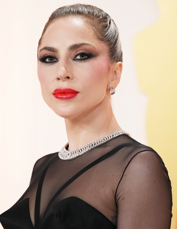
I don't understand the hype about this newsstand cover. It's not terrible, but neither is it groundbreaking. The brown eye make-up is very off putting and the chessboard background is a bit much.
As for the actual spread (shot by Terry Richardson), I think the space concept is pretty cool. It ties in with 'Venus' being a potential single from 'ARTPOP' and coincides with Lady Gaga becoming the first recording artist to perform in Space next year. She talks a bit about it in the interview, as well as her battles with depression and more.
Read the full interview here.
Thoughts?
Home / Fashion /
Lady Gaga /
Magazines /
Music Fashion /
Photoshoots /
Snapshots
/ Lady Gaga's Harper's Bazaar March 2014 cover spread...


